Choropleth Map
The topics in this section describe the features available in the Choropleth Map dashboard item.
The Choropleth Map dashboard item allows you to colorize the required areas in proportion to the provided values.
The Chloropleth Map dashboard item colorizes map areas in the following two ways:
-
Based on the values provided.
-
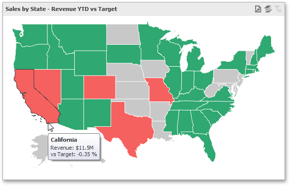
By indicating the difference between the actual and target values of a particular parameter.
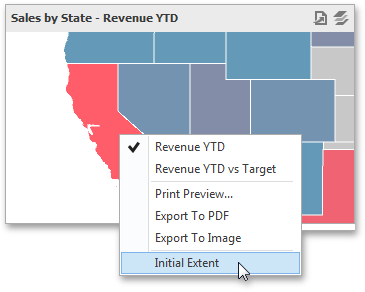
You can switch between the provided values using the Values button (the  icon) in the map's caption area, or by using the context menu.
You can use the mouse wheel to change the current zoom level for the map. To scroll the map, hold down the left mouse button and drag it.
To move to the initial zooming and scrolling state, select the Initial Extent menu item in the map's context menu.
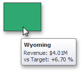
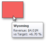
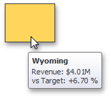
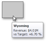
The Choropleth Map dashboard item can display a tooltip that shows information on a hovered area.

Providing Maps
This document explains how to use the default BI Dashboard maps, or provide custom maps.
Default Maps
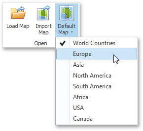
The BI Dashboard ships with a set of default maps showing various parts of the world. The following maps are included:
-
World Countries: A world map
-
Europe
-
Asia
-
North America
-
South America
-
Africa
-
USA
-
Canada
Note that the World Countries map has a lower level of detail than maps of specific regions and may not contain some countries. As an alternative, you can load a custom map with the required granularity.
To select the required default map, use the Default Map button in the Open group of the Design ribbon tab.
As an alternative, use the corresponding command in the map context menu.
Custom Maps
A Shapefile vector format to provide custom maps. Commonly, this format includes two file types:
-
.shp file - holds map shapes(points/lines/polygons).
-
.dbf file - contains attributes for each shape.
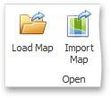
To open an existing shapefile, use the Load Map or Import Map button in the Ribbon, or the command in the context menu (Load Map or Import Map).
In the invoked dialog, locate the required .shp file. Note that custom maps created in the Cartesian coordinate system are not supported.
If the map is opened using the Load Map button, the dashboard XML definition will contain the path to a map shapefile. If the map is opened using the Import Map button, the dashboard XML definition will contain the map itself.
Map Attributes
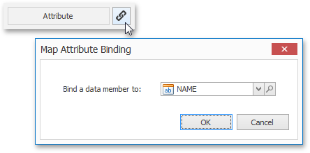
After you select the default map or a custom map, you can view supplemental information (such as the name of the country, state, etc.). To do this, click the Options button next to the Attribute placeholder.
In the invoked Map Attribute Binding dialog, click Preview.
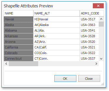
This table displays the available attributes for the current map. Each set of attribute values is related to a specific map shape.
Providing Data
The Dashboard Designer allows you to bind various dashboard items to data in a virtually uniform manner.
The only difference is in the data sections that the required dashboard item has. This topic describes how to bind a Choropleth Map dashboard item to data in the Designer.
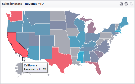
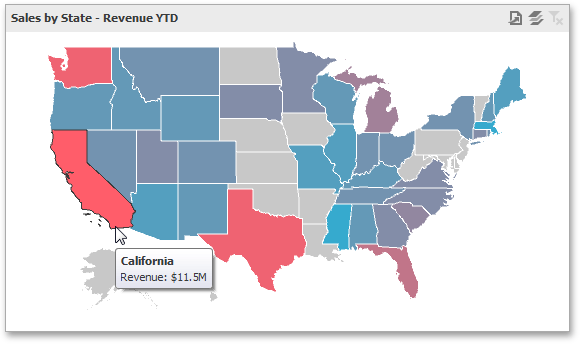
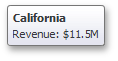
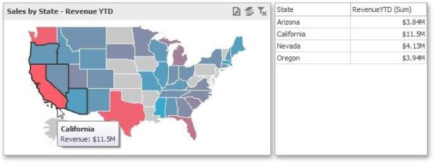
The image below shows a sample Choropleth Map dashboard item that is bound to data.
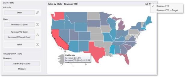
To bind the Choropleth Map dashboard item to data, drag and drop a data source field to a placeholder contained in one of the available data sections. The Choropleth Map provides two data item groups for data binding: Data Items and TOOLTIP Data Items. Tables below list the available data sections.
Data Items
Attribute: Allows you to associate map shapes with data source field values.
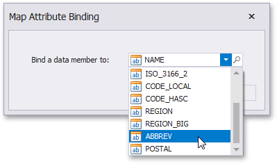
To associate map shapes with data source field values, drag-and-drop the required dimension to the data item's placeholder and select the required attribute in the Map Attribute Binding dialog. To invoke this dialog, click the Options button (the  icon) next to the Attribute placeholder.
Select the required attribute and click OK.
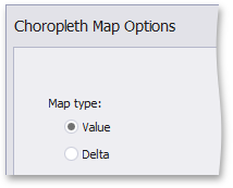
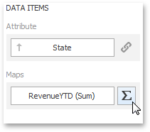
Maps: Contains Data Items whose values are used to color map shapes. Map shape colors vary based on the map type.
Click the Options button (the  or
or  icon depending on the map type) next to the Value placeholder and select the required map type in the invoked Choropleth Map Options dialog.
-
If you select Value, the Choropleth map colors map shapes depending on the values provided.
-
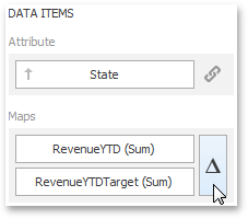
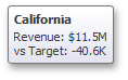
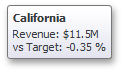
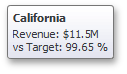
If you select Delta, the Choropleth map colors map shapes depending on the difference between two values. To learn how to specify delta indication settings, see Delta.
You can fill several data item containers in the Maps section and use the Values drop-down menu to switch between the provided values. To invoke the Values menu, click the icon in the dashboard item caption.
Tooltip Data Items
Measures : Allows you to add supplementary content to the tooltips. Drag and drop the required measures to provide additional data.
Map Coloring
The Choropleth Map dashboard item colors map shapes depending on the data provided. For instance, you can visualize a sales amount or population density.
Palette and Scale Settings
The Choropleth Map automatically selects palette and scale settings to color map shapes.
If you need to customize these settings, click the Options button next to the data item that contains these values.
This invokes the Choropleth Map Options dialog.
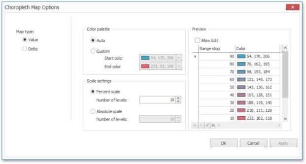
You can specify the following settings in this window:
-
Color palette: Allows you to specify the start and end color of the palette.
-
Scale settings: Specifies whether a percent scale or an absolute scale is used to define a set of colors. You can specify the number of levels that represent the number of colors used to color the map.
-
Preview: Used to display a full set of palette colors generated based on the start/end colors and the number of levels. Use the Allow Edit check box to automatically change the generated colors or specify value ranges for each color.
Also, the Choropleth Map allows you to visualize the difference between the actual and target values of a particular parameter.
Delta
The Choropleth Map allows you to indicate the difference between the actual and target values of a particular parameter. This difference is called delta.
Delta Options
To specify delta indication settings, click the Options button next to the data item container.
This invokes the Choropleth Map Options dialog. When the map type is set to Delta, this dialog contains the following settings.
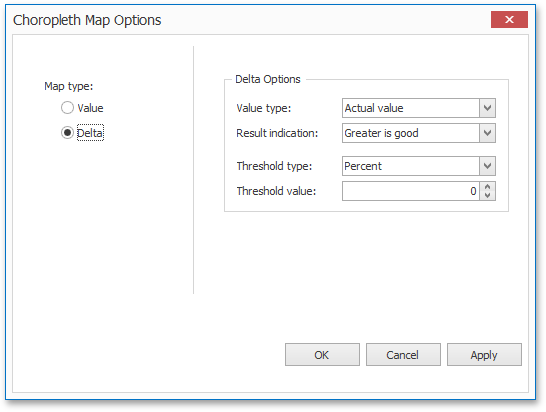
Value Type: You can specify which values to display within map tooltips. Use the Value type combo box to select the value that will be displayed as the delta value.
|
Actualvalue |
|
|
Absolutevariation |
|
|
Percentvariation |
|
|
Percentof target |
|
Result Indication
You can specify the condition that will be used to select the indicator color. To do this, use the Result indication combo box.
|
Greater isgood |
|
|
Lessis good |
|
|
Warningif greater |
|
|
Warningif less |
|
|
Noindication |
|
Threshold Type and Threshold Value
You can specify that a required indicator should only be displayed when the difference between the actual and target values exceeds a specified value. For instance, the actual value exceeds the target value by 10%, or by $2K.
Use the Threshold type combo box to select whether you wish to specify the threshold in percentage values or in absolute values. Then use the Threshold value box to specify the threshold value.
Map Navigation
The Choropleth Map dashboard item allows you to perform navigation actions such as zooming and scrolling.
The Dashboard Designer allows you to specify the initial zooming/scrolling state for the Choropleth map using the mouse.
You can disable the capability to scroll/zoom the map using the Lock Navigation button in the Design ribbon tab.
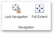
Use the Full Extent button to display the entire map within the dashboard item.
Interactivity
This document describes the Master Filtering feature, which enables interaction between the Choropleth Map and other dashboard items.
Master Filtering
The Dashboard allows you to use any data aware dashboard item as a filter for other dashboard items (Master Filter).
When Master Filtering is enabled, you can click a shape (or multiple shapes by holding down the CTRL key) to make other dashboard items only display data related to the selected shape(s).
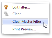
To reset filtering, use the Clear Master Filter button (the  icon) in the map's caption, or the Clear Master Filter command in the map's context menu.
Labels
A Choropleth map provides the capability to display titles within map shapes and allows you to manage what data to show in the shape tooltips.
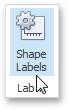
To manage map titles and tooltips, click the Shape Labels button in the Design ribbon tab.
This invokes the Shape Label Settings dialog.
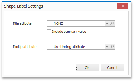
In this dialog, you can specify attributes whose values will be displayed within shapes and tooltips. Use the magnifying glass button to preview the available attributes and their values for the current map.
Shape Tiles
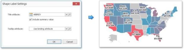
The Title attribute option allows you to select the attribute whose values are displayed within corresponding map shapes.
You can also use the Include summary value option to add summary values to shape titles.
Tooltips
The Choropleth Map dashboard item displays a tooltip that shows information related to a hovered shape.
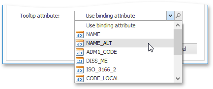
You can choose whether to use a binding attribute to display as the title of shape tooltips (the Use binding attribute option) or specify a custom attribute using the Tooltip attribute option.
The Choropleth Map also allows you to add supplementary content to the tooltips using the Tooltip Data Items area.
Legend
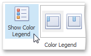
A legend is an element of a map that shows values corresponding to each color.

Visibility
To display a legend within a map, use the Show Legend button in the Legend group of the Design Ribbon tab.
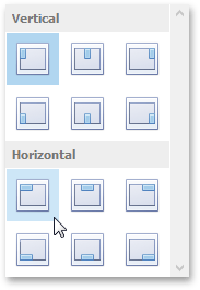
Position and Orientation
To specify the legend's position and orientation, select one of the predefined options from the gallery in the Design Ribbon tab.